Learn Youtube Packaging from +60 Redesigns
Examples of redesign (mock-ups)
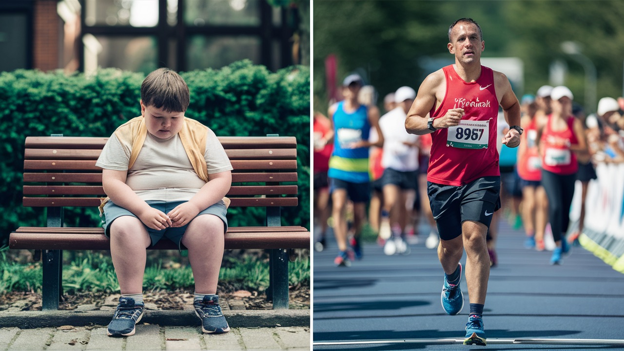
Original :
My analysis :
Just added a polarizing element.
New idea :
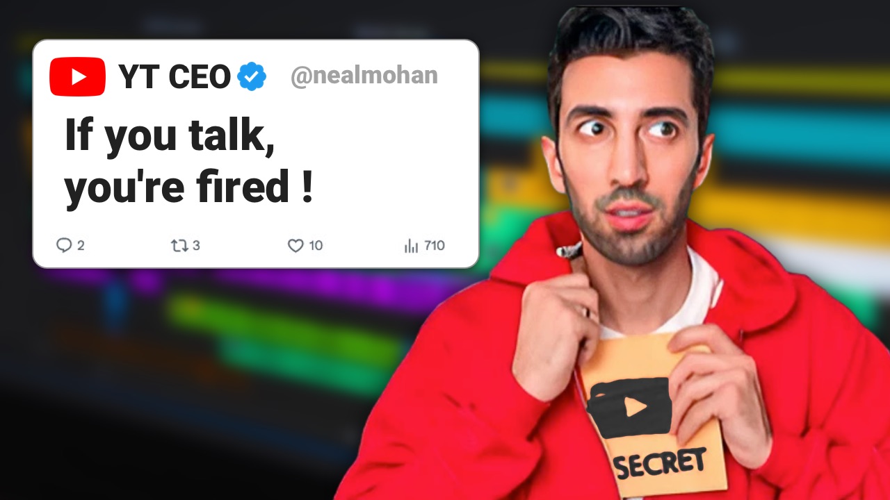
Original :
My analysis :
I showed in the most clear manner the video's topic.
New idea :
Original :
My analysis :
I placed the culprit in action to provoke a strong reaction.
New idea :
Original :
My analysis :
I used the game's universe to deliver the same message that the players would appreciate.
New idea :
Original :
My analysis :
I illustrated the idea with a famous example.
New idea :
Original :
My analysis :
A close up of the injured feet creates a stronger emotion.
New idea :
Original :
My analysis :
I made a more realistic version.
New idea :
Original :
My analysis :
I removed the text that repeated the title, and this allowed the focus to be on the empty seat.
New idea :
Original :
My analysis :
I brought more emotion by linking the DVD with an actual movie from which a character always comes back.
New idea :
Original :
My analysis :
I brought several cosmetic tweaks to stand out from the many similar thumbnails. I also made the title more clickbait.
New idea :
Original :
My analysis :
-
New idea :
Original :
My analysis :
I offered different approaches with stronger emotions
New idea :
Original :
My analysis :
Original thumbnail was too clutered
New idea :
Original :
My analysis :
Original angle was a little boring for this topic covered many times
New idea :
Original :
My analysis :
Original was clutered, disharmonious and missed the most important point.
New idea :
Original :
My analysis :
"stronger than concrete" did not make sense and "ice made of ice" neither.
New idea :
Original :
My analysis :
I played on the fact that the review is obviously biased...
New idea :
Original :
My analysis :
Original didn't show a clear link between money and google sheets. I suggested to use a sort of google sheet card in an actual wallet.
New idea :
Original :
My analysis :
Original didn't really look like a challenge or that there was a stake.
New idea :
Original :
My analysis :
The thumbnail was not matching the first frames of the inroduction and the title left some doubts. I cleared that up.
New idea :
Original :
My analysis :
Original was very confusing.
New idea :
Original :
My analysis :
The original thumbnail said "shouting out of the box". I used AI as well to get an image closer to thinking outside of the box.
New idea :
Original :
My analysis :
The circular arrows gave a recycle turning movement, and the computer was the main focus instead of the app. Folowwing my advice the owner made 2 new designs.
New idea :
Original :
My analysis :
Improved focus on key elements.
New idea :
Original :
My analysis :
Added more contrast, made the text different from the title, added emotion through text.(French channel)
New idea :
Original :
My analysis :
The original thumbnail had no real concept.
I'm showing distractions actually helping you focus.
New idea :
Original :
My analysis :
The original thumbnail repeated the title. I put a different and shorter text for a stronger impact.
New idea :
Original :
My analysis :
The original failed to convey clearly and simply the message that the same pilot lost once it joined Ferrari.
New idea :
Original :
My analysis :
My creative take on this video
New idea :
Original :
My analysis :
The original thumbnail although extremly visible lacked emotion and depth.
New idea :
Original :
My analysis :
The original thumbnail said "ideas worth $1M" while the video is a challenge with a transformation or some action.
New idea :
Original :
My analysis :
The original thumbnail was too soft so I brought emotions.
New idea :
Original :
My analysis :
Originals did not convey the message clearly or missed the point.
New idea :
Original :
My analysis :
Both original thumbnails were busy, disharmonious and unclear regarding the link between number of houses, their price and homelessness.
New idea :
Original :
My analysis :
No original thumbnail was provided, I immediatly had the idea to contrast a scandalous dress with the puritan american Church. AI did a perfect job.
New idea :
Original :
My analysis :
Originals look like advertisements and don't clearly present the video's content.
New idea :
Original :
My analysis :
The original packaging seemed like a movie director's guide or a historic overview of silent fim while the video is about enticing people to try out silent movies.
New idea :
Original :
My analysis :
I don't know who that chick is, I could mistake it for yet another video about AI tools. The game hub name and logo are generic, I don't know if it's a brand or the text of the thumbnail. Regarding the titles, I think they missed a strong angle.
New idea :
Original :
My analysis :
The original packaging although attention grabing did not take advantage of the unique branding of Liquid Death.
New idea :
Original :
My analysis :
The original thumbnail make waking up early look difficult and painful. There is also no high contrast. I made it look as easy as a toast.
New idea :
Original :
My analysis :
The original was a ripoff of another video. The "mort" (death) word alone didn't make sense. I took the official logo and turned it against itself. (french channel)
New idea :
Original :
My analysis :
Showing the actual link between watermelon and racism. And added emotion.
New idea :
Original :
My analysis :
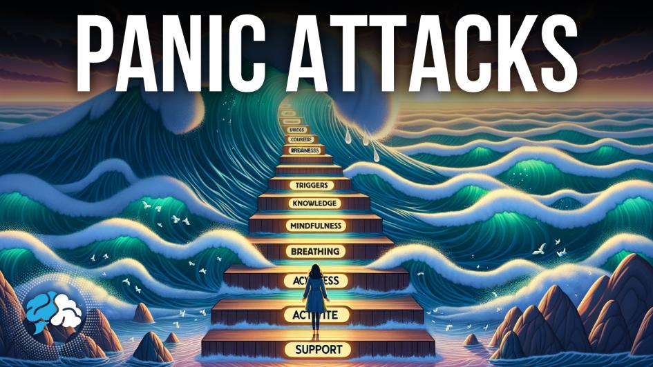
I gave a better representation of brain fog.
New idea :
Original :
My analysis :
I made it more punchy.
New idea :
Original :
My analysis :
The original image was not clear as to who the kid is and its relation to the company. Here I clearly showed the drama.
New idea :
Original :
My analysis :
The original video was about the bad taste of a chocolate. The elements were not coherent with the message so I redesigned it by taking an ironical angle (a fake ad). Now the chocolate is so bad it will turn you into a zombie.
New idea :
Original :
My analysis :
Example of thumbnail done with various AI generated assets.
Here a roblox gamer reacting.
New idea :
Original :
My analysis :
Find a prompt that chatgpt normally refuses to execute, and make a thumbnail where it does execute it. Eventually you can add a hacker, possibly looking at the screen where the prompt is.
New idea :
Original :
My analysis :
1&2) We see neither a panic attack nor a peaceful person. A peaceful person is more convincing than reaching a mountain top.
3) The calm part of the face looks anxious, there's emotion contamination.
New idea :
Original :
My analysis :
People are too far we don't know who is important, nothing is happening, contrast is low. Text is generic.
New idea :
Original :
My analysis :
Place a bottle of soy milk next to a glass of soy milk, add a toxic icon on the bottle, don't put text, then find a title to make people click.
New idea :
Original :
My analysis :
Too small and I don't understand. So I would represent a close up view of typical saudi guy in front of a typical lab scientist in the desert. The scientist is holding sand in his hand or in small container, pointing at it and saying something like "this is gold" or "we found something" and the saudi is making a shock/amazed face. Possibly there's a tiny plant growing in that sand.
New idea :
Original :
My analysis :
Put Arnold's head on that skinny body, give him some broccoli. Done.
New idea :
Original :
My analysis :
Put an actual autumn scenery in the background (trees + street) and point an arrow to one key item of the outfit and name it.
New idea :
Original :
My analysis :
I suggest zooming out a little to see the tip of the nose and understand that it's the same face, not 2 faces cheek to cheek.
New idea :
Original :
My analysis :
Thumbnail is too busy we don't understand the scene, and there is no emotion.
New idea :
Original :
My analysis :
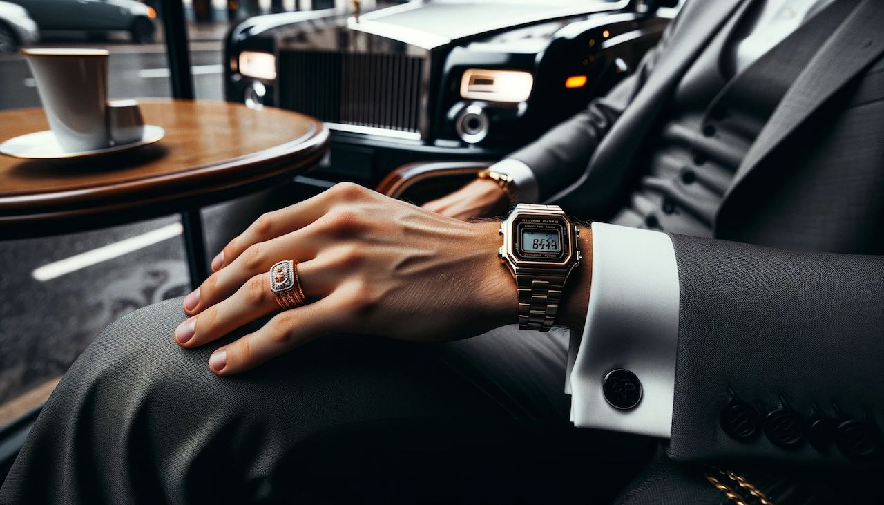
People will click out of curiosity, but curiosity is not enough for a good watchtime. A little somethign is missing for them to have a real expectation that will last the whole video. I would change the title to something like "Why millionaires don't wear Rolex" or the thumbnail text to "Swiss made" crossed out.
New idea :
Original :
My analysis :
I thought it was coffee. If the seeds are the topic they should cover 30% of the image. You're putting too much emphasis on "was" which could indicate that he was right but not anymore. The background removal and glow are a little ugly, you would get a much better result with AI.
New idea :
Original :
My analysis :
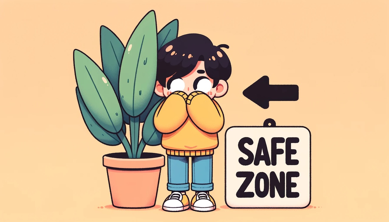
I would say the one with the plant in a pot. But in this one the bush one, the person is looking the wrong way (or I don't get it and this is what is actually weird). The curtain one looks like a horror cartoon. I would use the text as title, and use another shorter text saying "safe zone ->". The cartoon itself needs to be bigger.
New idea :
Original :
My analysis :
Very low contrast and blueish tint on the portraits. Misleading ironic title. Since the 3 portrayed people are known for making lot of views I thought of turning them into criminals who robbed/hijacked youtube. (French channel)
New idea :
Original :
My analysis :
Upcoming video about James Mai and Charlie Ledley
New idea :
Original :
My analysis :
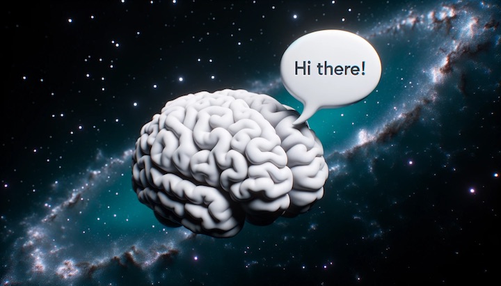
Hmmm this is a case where A/B testing would be very useful. The first one is somewhat classic. We expect a title like "Are galaxies nothing but giant brains ?? science discovery". The second one is more mysterious. The brains look like evil sentinels from The Matrix. We expect a more personal opinion on the matter.
New idea :
Original :
My analysis :
The design is orignal but overly complex for what a timeline really is.
New idea :
Original :
My analysis :
The thumbnail is a still image from the footage,it is realistic but does not show action or danger.
New idea :
Original :
My analysis :
It seems to be a working concept ! You could push it further and make it more realistic with a referee cutting/pulling open the ball and revealing what's inside. The electronic device should be a tiny chip in the ball skin rather than a full motherboard in the air.
New idea :
Original :
My analysis :
The original idea is very banal, every thumbnail of every murder channel could use it. The title is absolutely not clickbait.
Simply watching the video gave me the unique keywords related to this case.
New idea :
Original :
My analysis :
It doesn't look like an insane moment. The police cars could be confused with the safety cars. If you put that F1 on the city street then...
New idea :
Original :
My analysis :
One of the items should be a different color for contrast. The car is ugly but cute kind of ugly so nobody will care much. So instead we should pick a car whose design people are going to fight over.
New idea :
Rights for the original thumbnails (left collumn) belong to their respective authors or to the owner of the channel where they were published.
Contact me for a quote
FAQ
A design takes an hour so nope !
At least an angle, that is your unique approch/covering of the topic.
The edited video, or the script.
The channel's branding if any (font file & color chart)
No I will not do crazy "dodge and burns" like the top youtubers have on their face channels. Don't hire me for this.
A little, I can swap faces, change clothes etc but I'm not a PhotoShop artist
You get the rights to modify the image and make profit from it.
Occasionally yes.
Either there are not enough impressions, in this case you need to repost the video. Or the video is not good enough to compete in the niche.
MilkyWay © • Affiliation • Legal Notice • Terms


